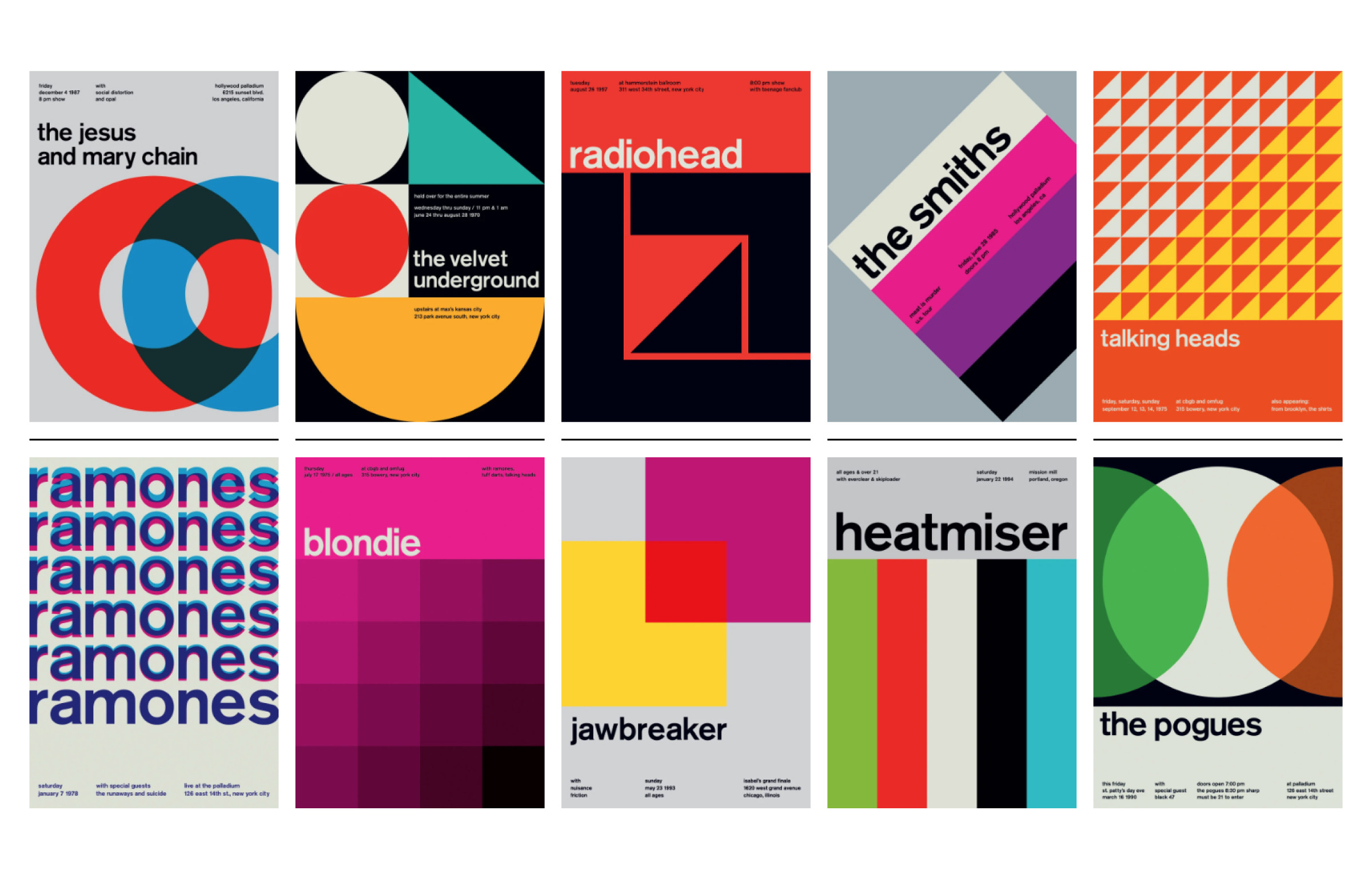
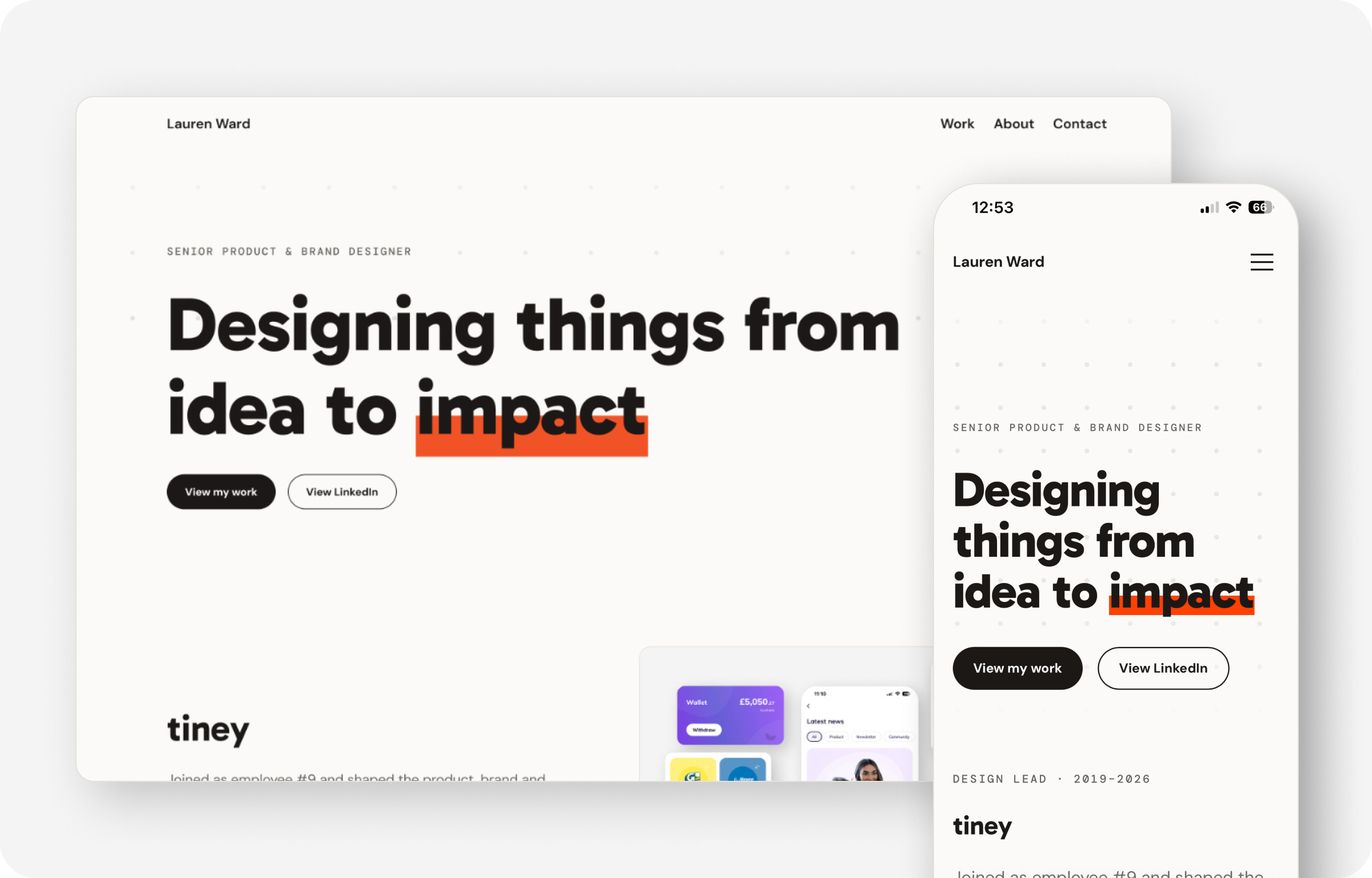
As an experiment, I didn't open Figma at all. I gave Claude Code my inspiration screenshots, Swiss typography references, a copy document and a strict prompt, then asked it to show me what it could do. It built a working site quickly. After sleeping on it, I realised I didn't like it at all, so I took the design back into Figma and let Claude Code handle the build.
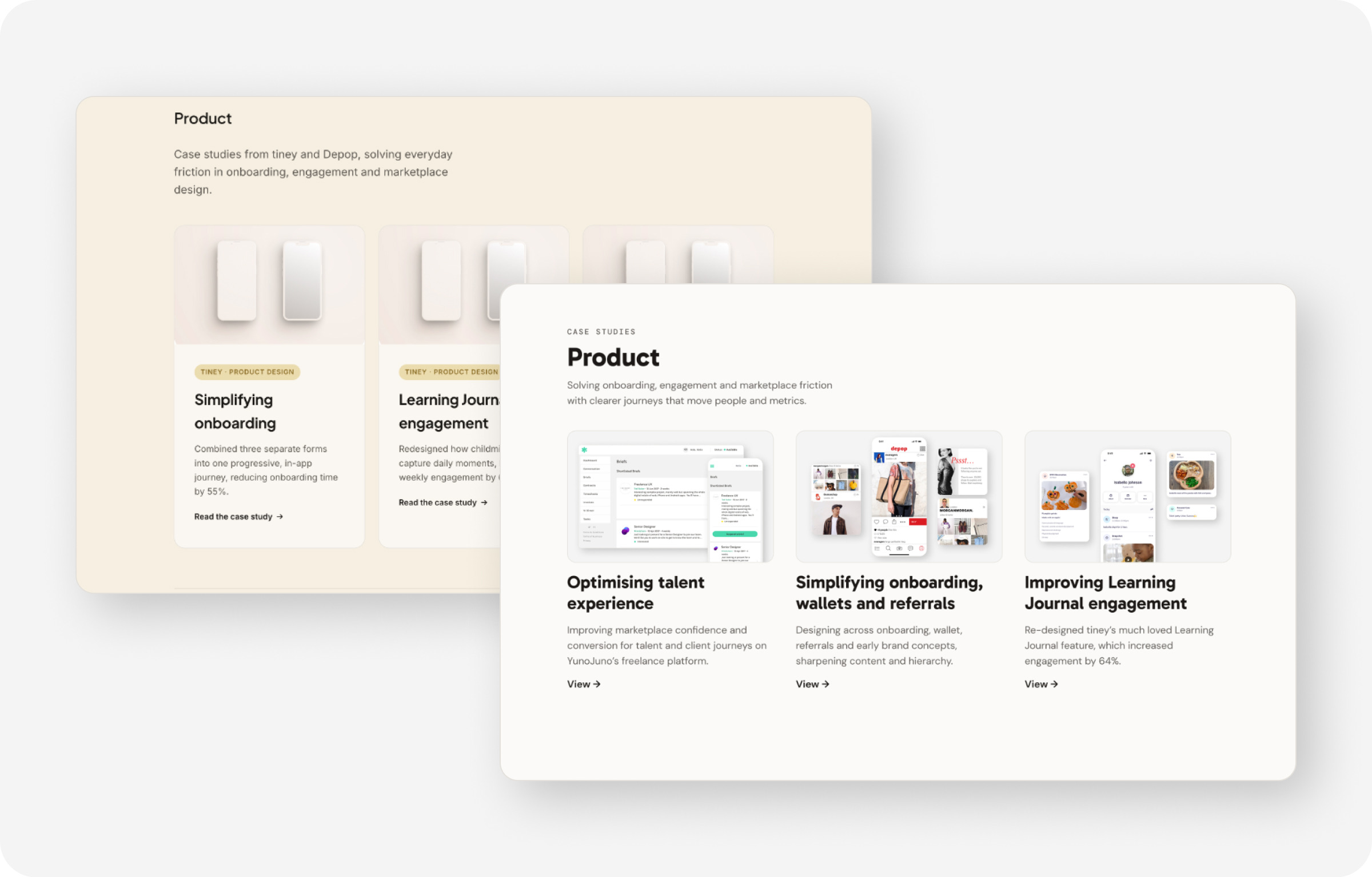
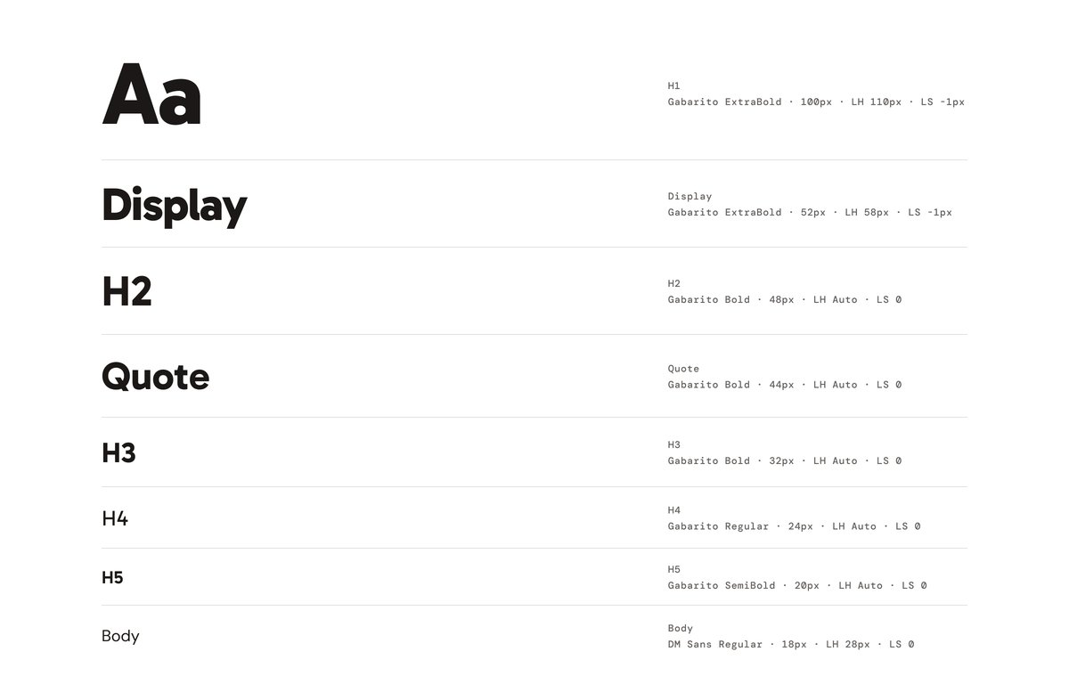
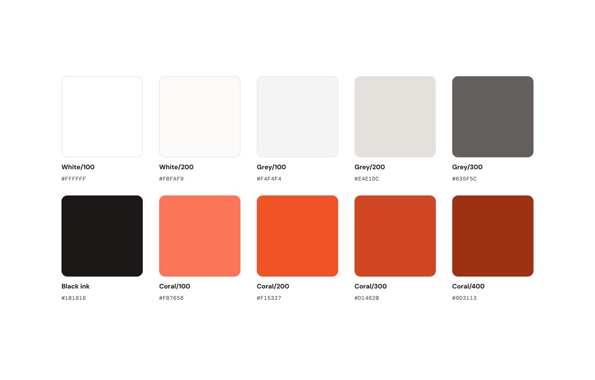
I kept the design clean and minimal so the work could lead. I pulled a burnt coral from a Swiss poster and paired it with a black ink and a warm off-white, checking every combination for accessibility and adjusting the coral where needed. For type, I paired Gabarito for headlines, for its rounded, balanced feel, with DM Mono for labels and DM Sans for body copy. I then designed a reusable case study template and deliberately cherry-picked screens, leaving room to talk through the rest in person.
I built the site in Claude Code inside VS Code, the workflow I'd started using at tiney. The first build from my Figma files was close but not right: padding and margins were off and some details were guessed. Connecting the Figma MCP through a developer seat changed that, as Claude Code could read my files directly and match spacing precisely. I tested on localhost across browsers and on my own phone, refining responsive behaviour and mobile padding as I went, and committed everything to GitHub.
I also added small moments of play that nod to Swiss posters without getting in the way. The hero background is a dotted pattern where dots repel each other like magnets as the mouse moves. The word “impact” clashes coral and pink on hover, with letters lighting up individually. Buttons fill with a circle that grows from wherever the cursor enters. Images zoom gently on hover. Each page ends with a personal quote in the footer that changes to sum up that page.